The start of a Design System
From research and planning to creating and implementing.
Results
- Reduced design & development time by 30%
- Easy to adapt and implement into current flow
- Improved UI consistency
- Scalable & flexible design and code base
Company
PeachPay
Time frame
2 months
Role
Lead product designer, UI Design, Design systems, UX Engineering
Overview
I established a design system at PeachPay, enhancing consistency, bridging design and development, and improving efficiency
As PeachPay grows, maintaining a consistent design across its products is crucial. Upon joining, I noticed the absence of a design system, prompting me to establish one with design tokens and smaller components like buttons. This marks the initial step in achieving a unified look, bridging the gap between design and development. Beyond enhancing user experience, it greatly improves efficiency for both designers and developers, fostering a common language between the two.
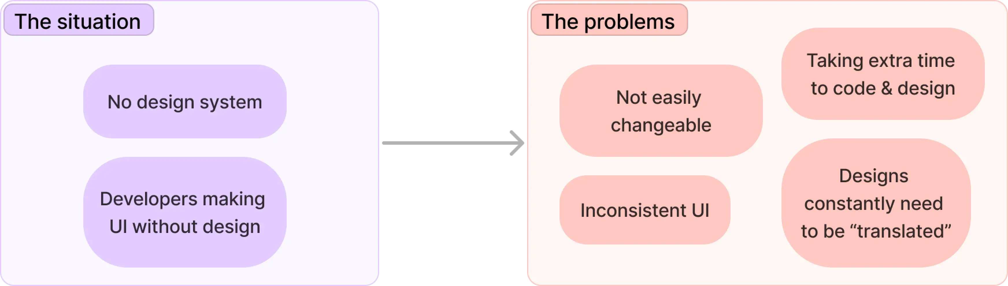
The situation
No defined variables or components, both on the design and development side.
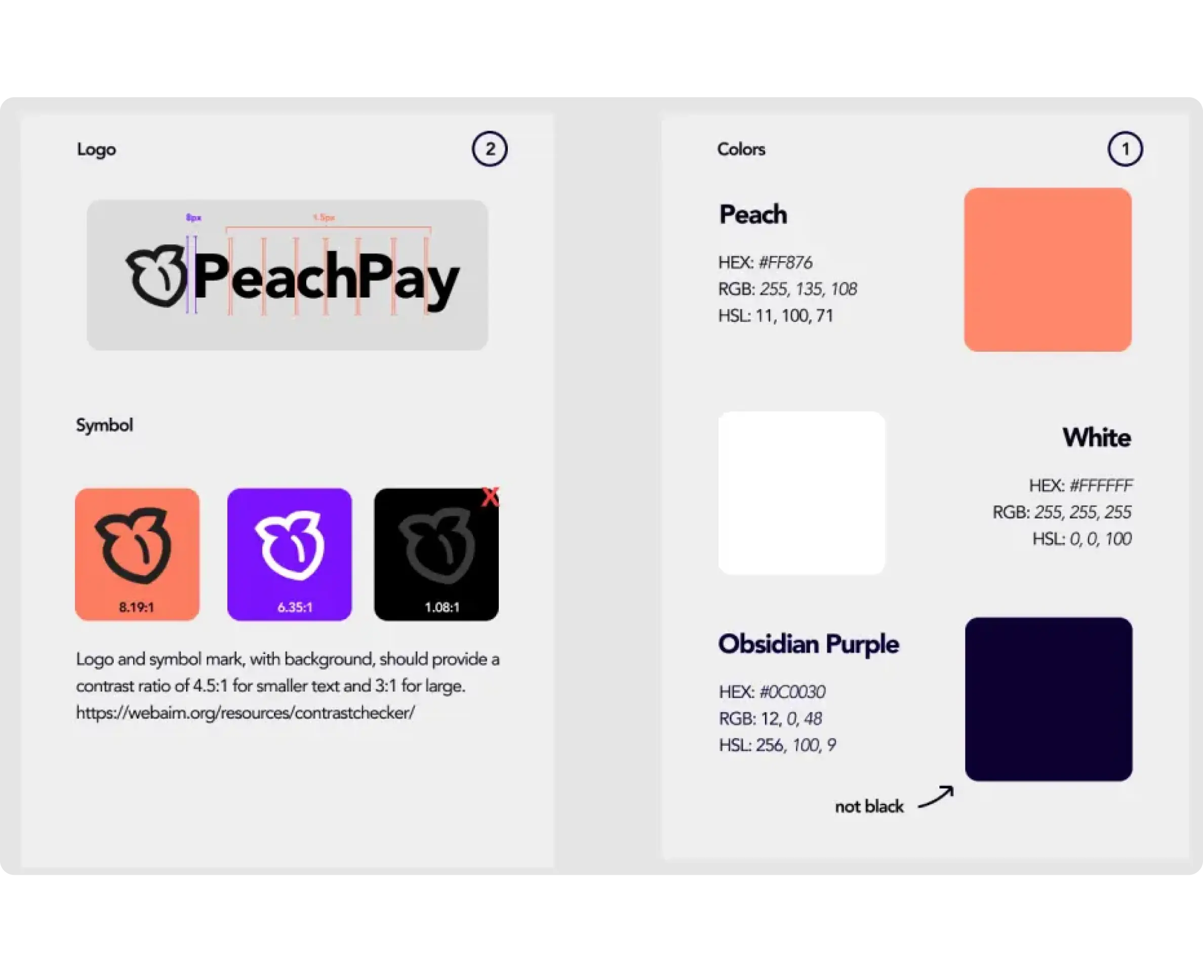
Design side
Only 3 colors and some logo variations
Dev side
Only a few color variables, some defined twice but with the same purpose
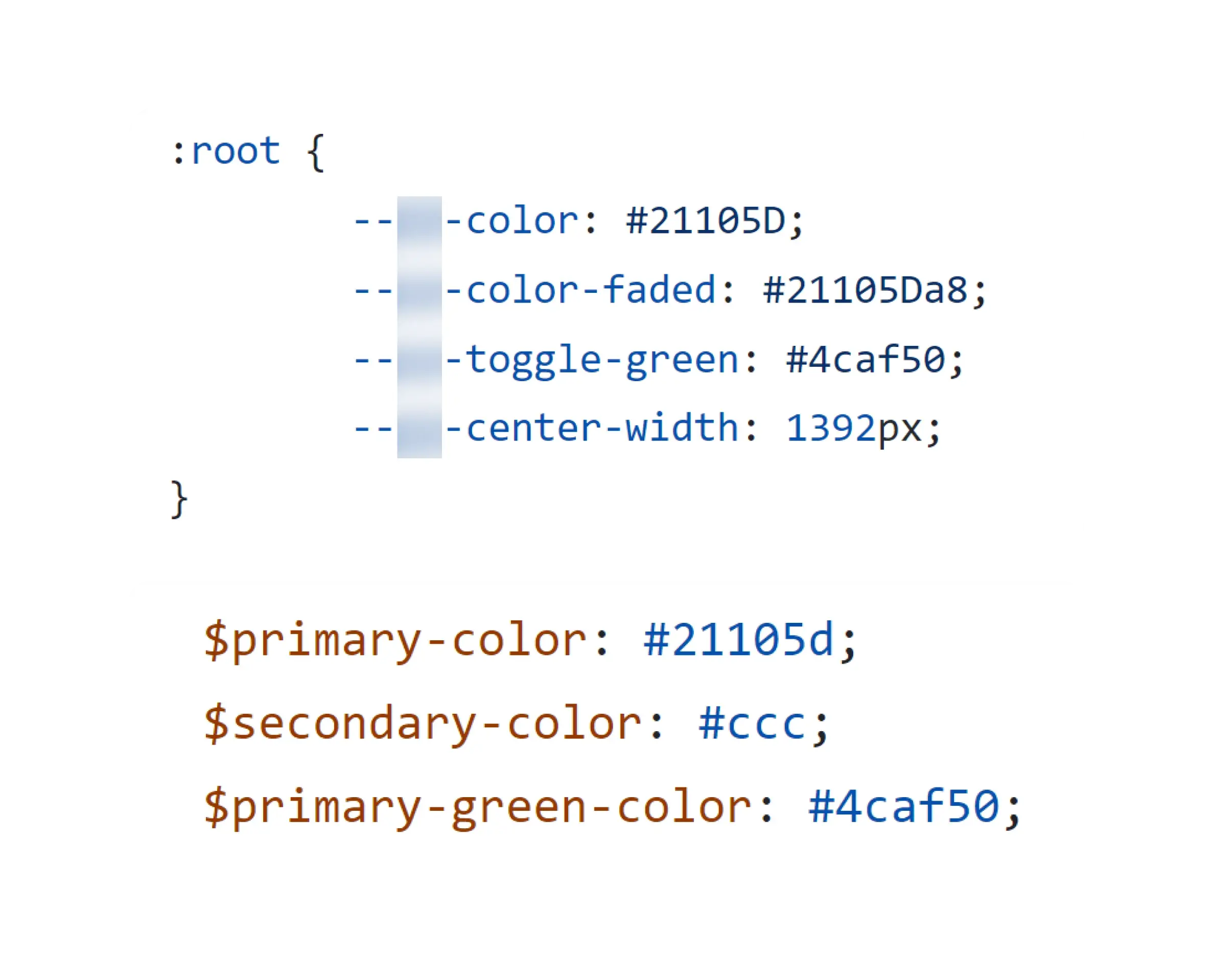
Dev side
Most CSS classes are using hex codes instead of the variables
Dev side
Components, like buttons, are defined in many ways
The situation
No defined variables or components, both on the design and development side.
Design side
Only 3 colors and some logo variations
Dev side
Only a few color variables, some defined twice but with the same purpose
Dev side
Most CSS classes are using hex codes instead of the variables
Dev side
Components, like buttons, are defined in many ways
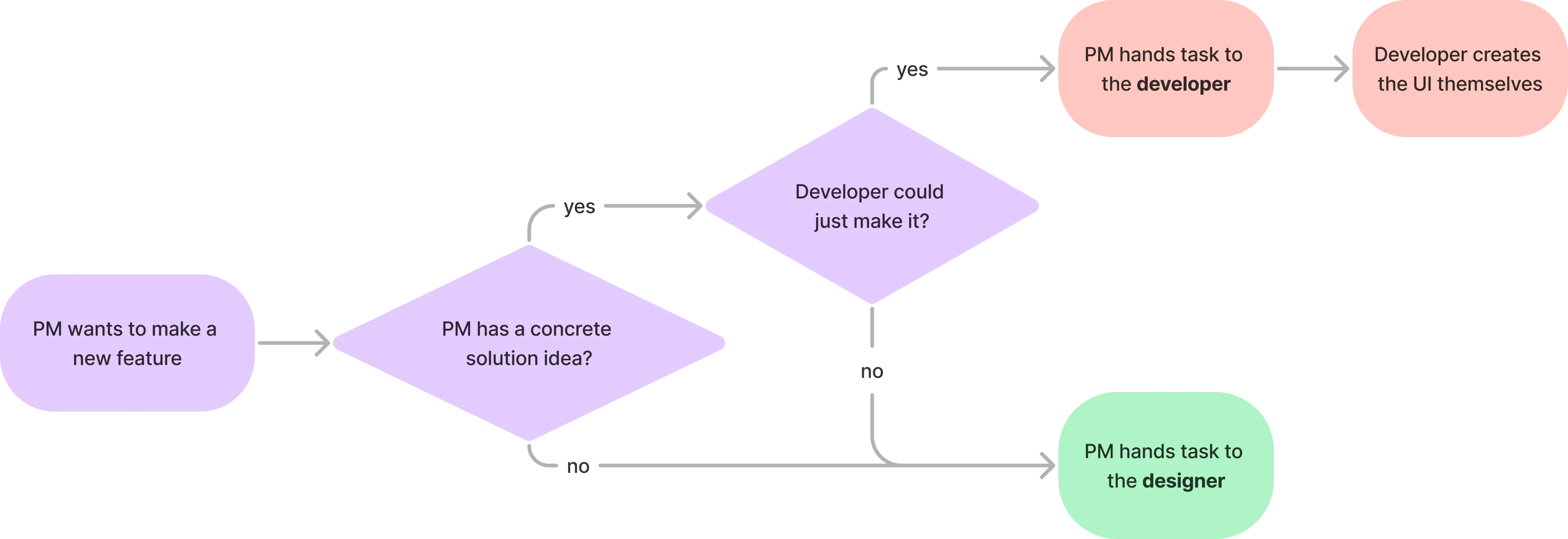
Current workflow
The PM often gave smaller tasks directly to developers without notifying designers, causing developers creating the UI themselves
As being the only and first designer at PeachPay, the PM often gave me bigger feature tasks. Whereas for smaller UI changes (eg adding a new button), he handed them to the developer directly skipping me - the designer. I noticed that this caused developers to often create new buttons adding to the problem.
The problem
Inconsistency and disconnect between and within design & development
The Goal
Create a design system that can help connect design and development and make them more efficient & consistent
Create consistency
With the new system, we should be able to create consistency within all the designs and code. It needs to help developers create consistent UI, even if the PM gives them a task without design.
Scalable, reusable, & flexible
Make a system that can be easy to update & change later on (eg. primary color change), and can also accomondate slightly different design elements without much effort.
Reduce design & dev time
The solution should help reducing the time needed to design and develop features, as creating new stylings and components should be limmited.
Easy to adapt
It should be easy to integrate into our current workflow and implement it into our current designs & codebase.
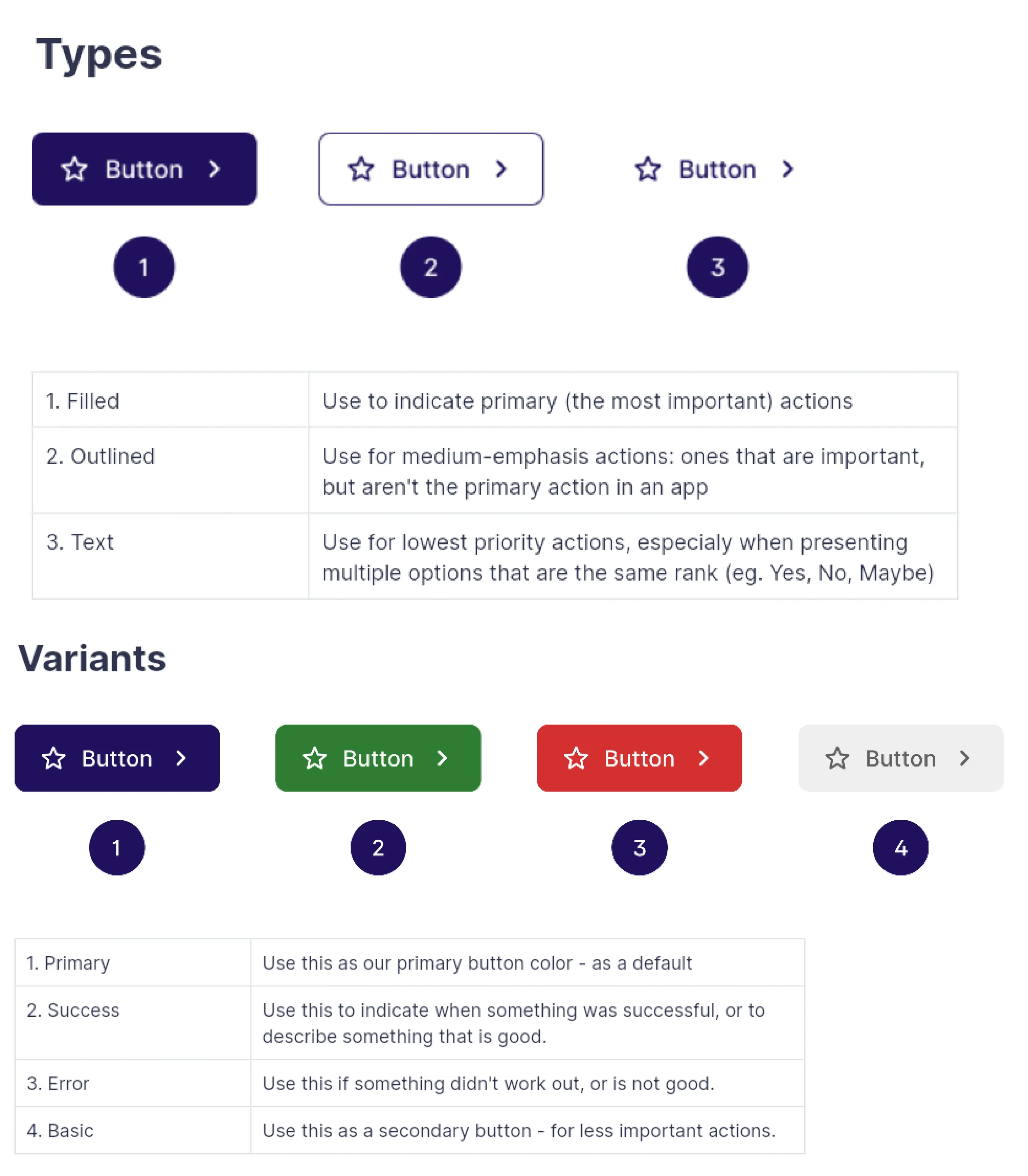
Project scoping
Focus on colors and buttons at first
Why?
- Doing all could take months make and implement
- Consistent colors could make a big visual impact
- Buttons are one of the most used components
What is not included
- Other variables than colors applied to the buttons
- Too many / complex colors
Research & Learning
I needed to learn more about color systems to achieve my goals, leading me to explore semantic naming for design tokens
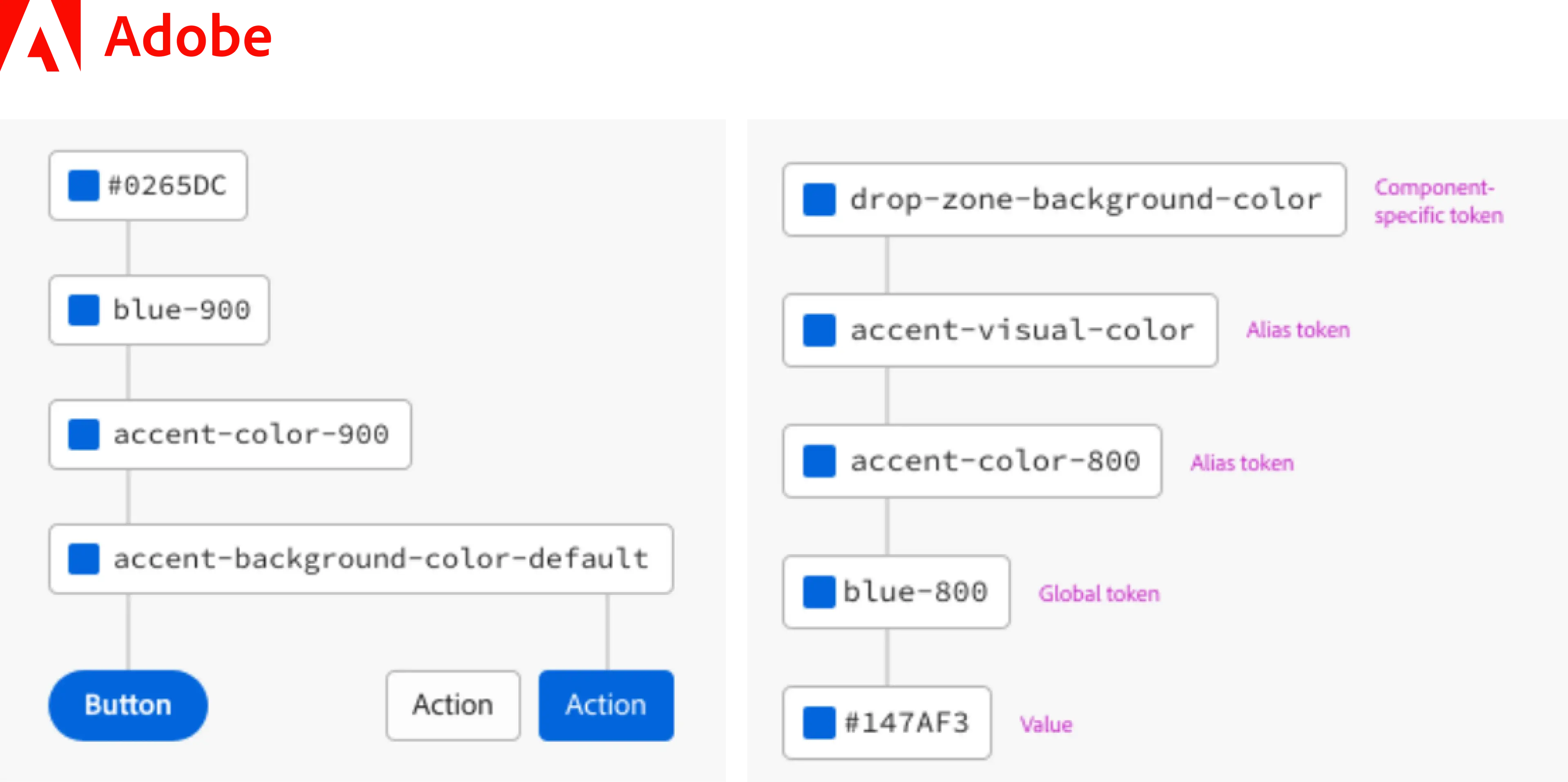
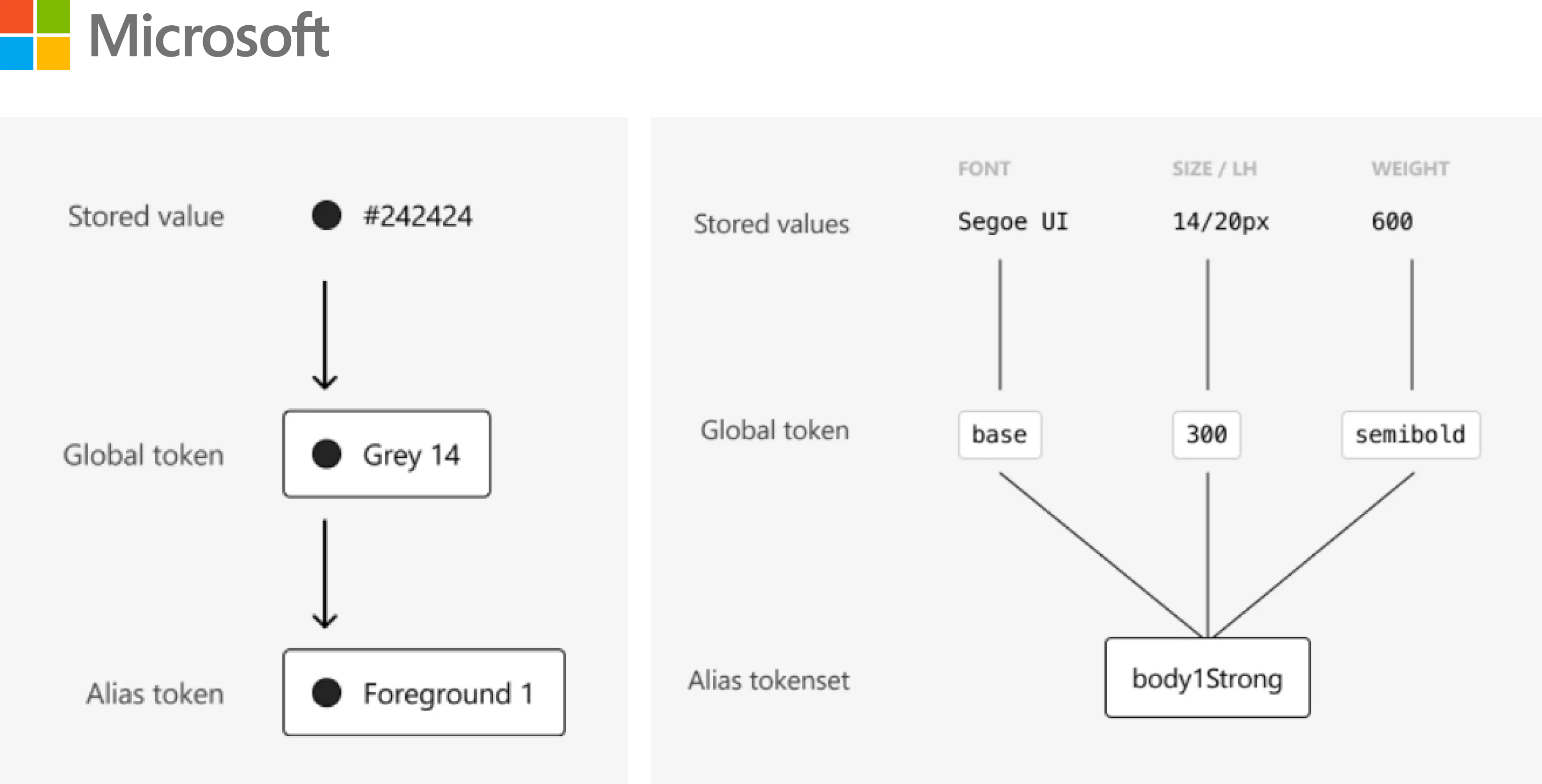
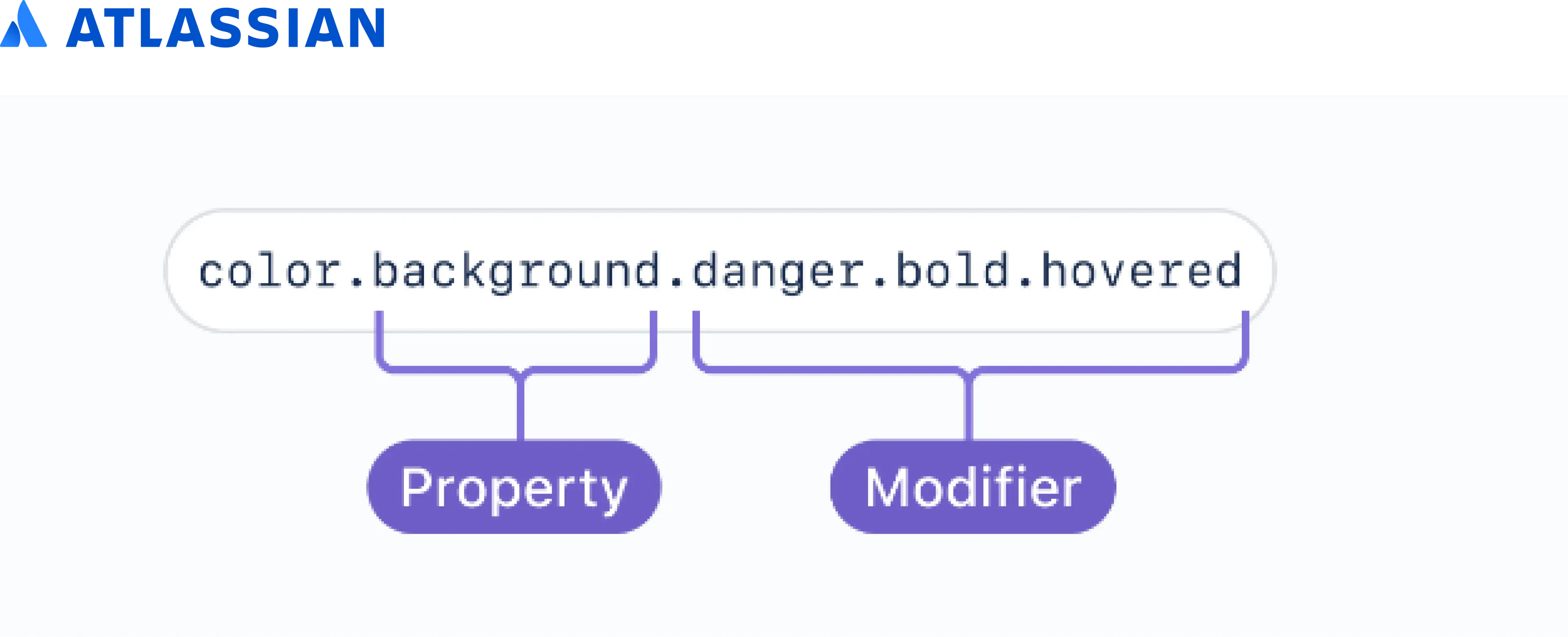
How do big companies do it?
I looked at design systems of companies like Adobe, Microsoft, and Atlassian to see what guides do they have for colors.
How do big companies do it?
I looked at design systems of companies like Adobe, Microsoft, and Atlassian to see what guides do they have for colors.
I read more articles on Medium, and watched youtube videos on the topic of design tokens and their namings
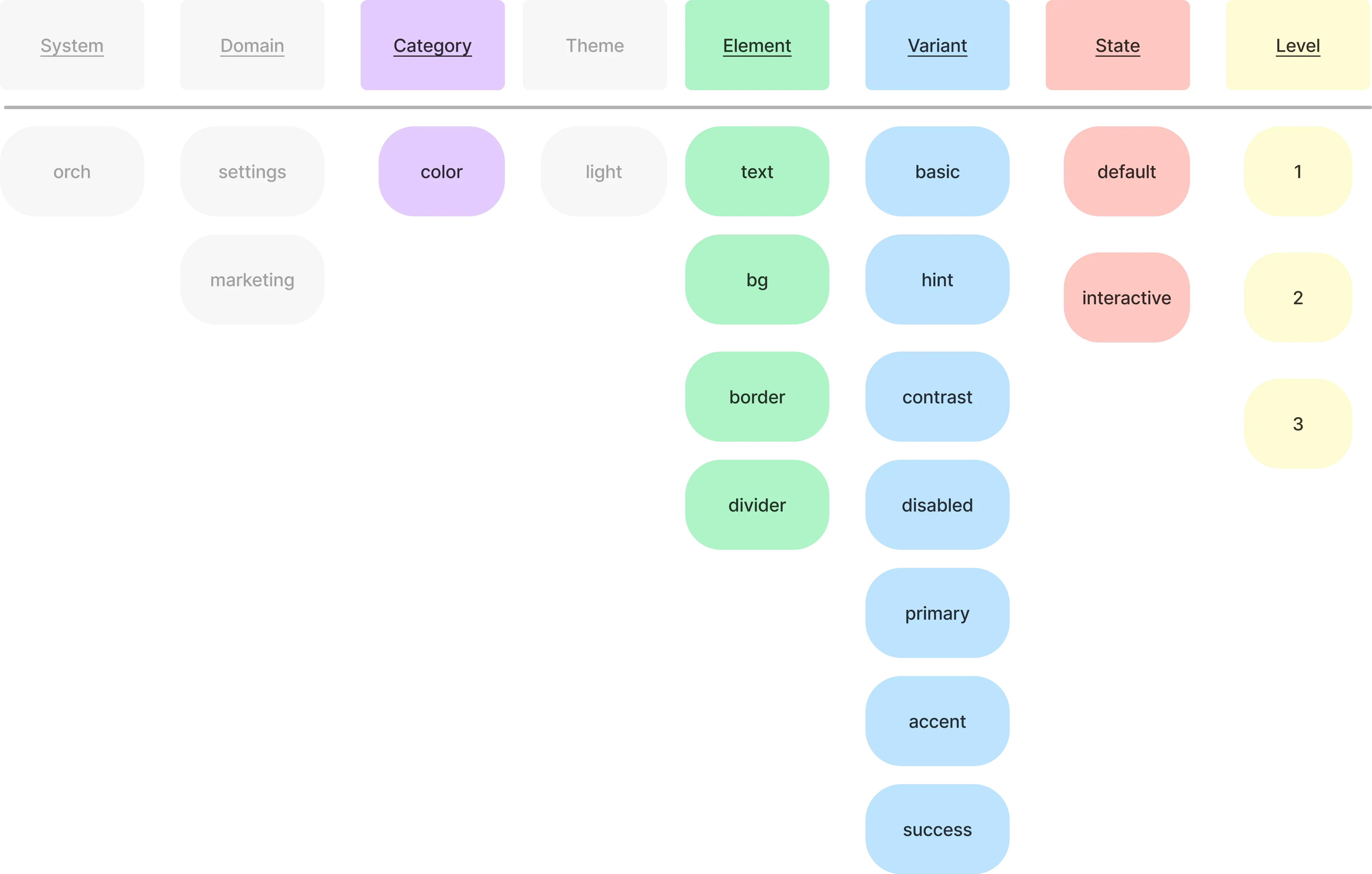
Lots of the articles were by Nathan Curtis, and through one of his articles, I stumbled across the following guide:

Planning
Based on my research & talking to developers (one of the end users), I sketched up the semantic naming system for colors
Initially, I planned to add in like a system name and account for light and dark themes, however after talking to developers, I realized that they would make the color variable names way too long and inconvenient that developers might end up refusing to use it.
Starting design system
After the planning, I created some of the base for our designs: colors and buttons
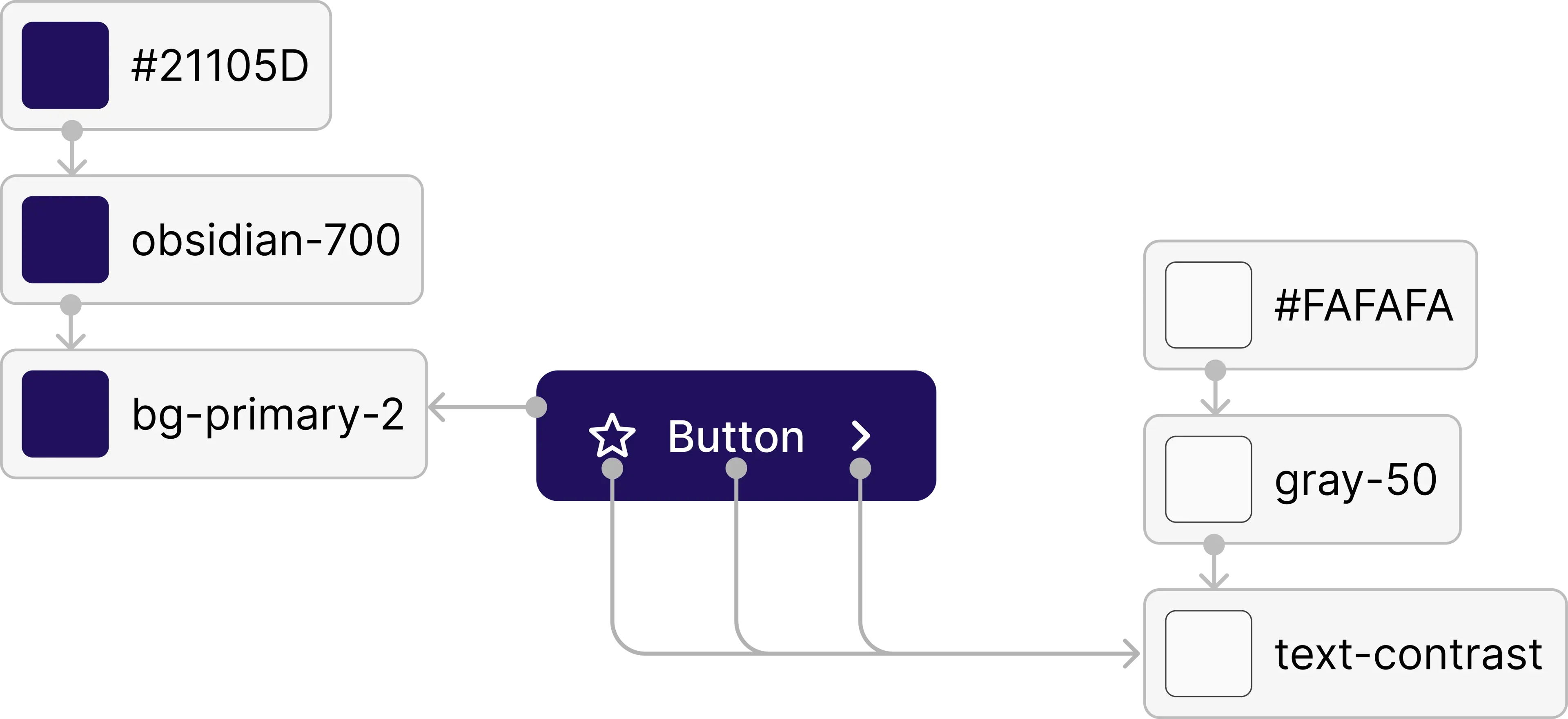
Base colors to start with
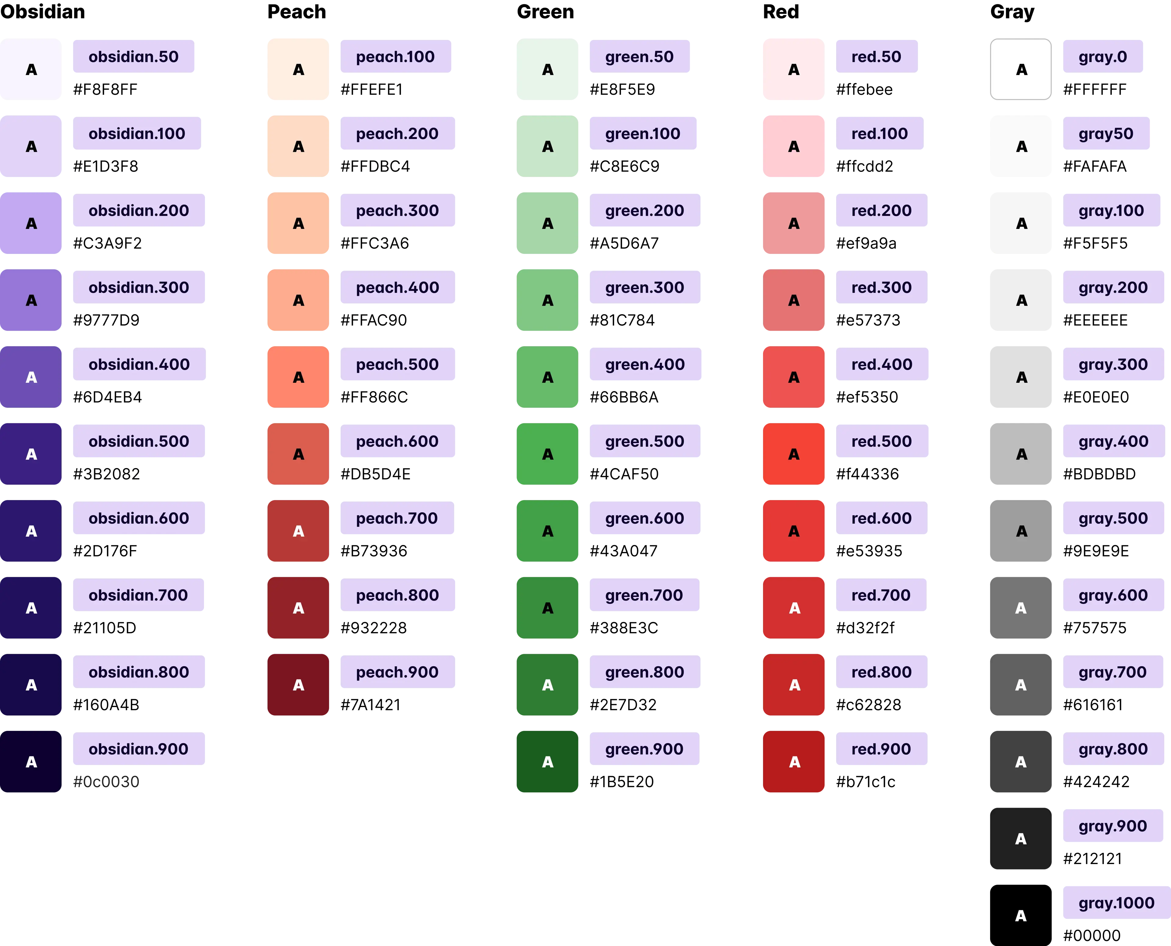
Some of the alias colors
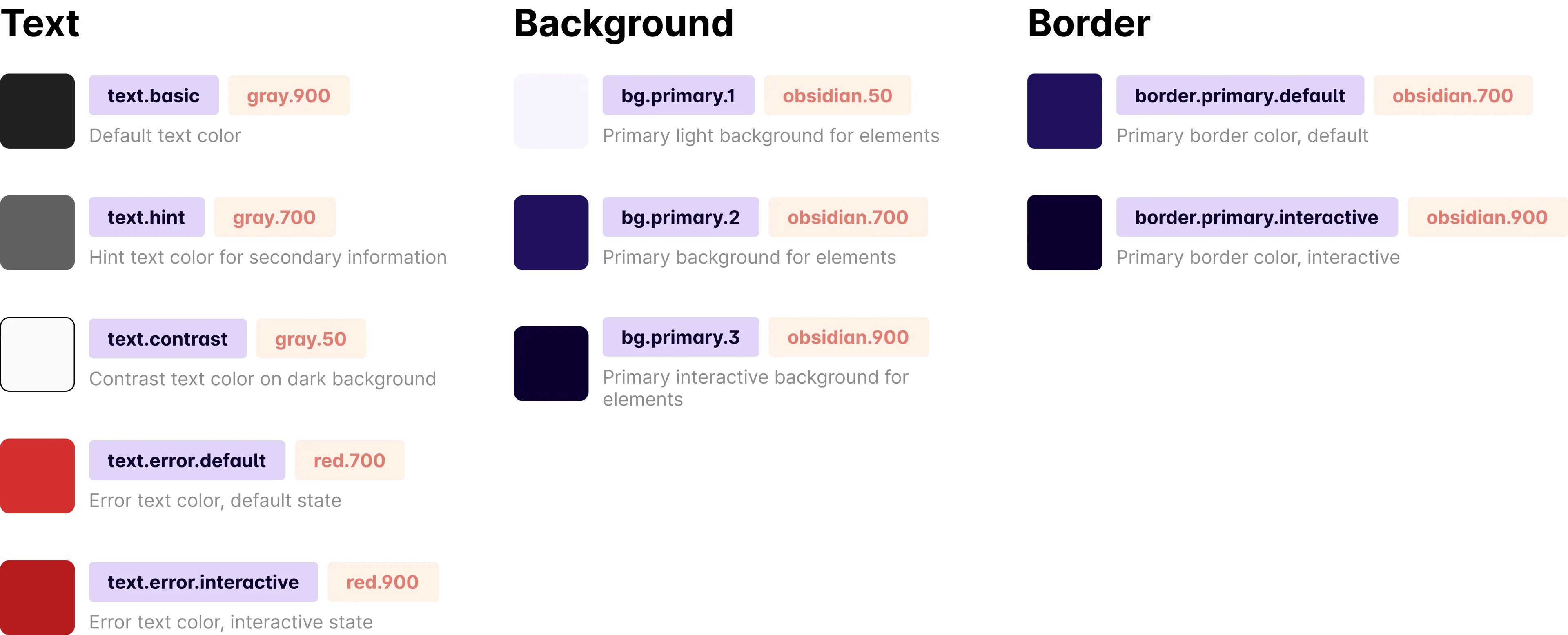
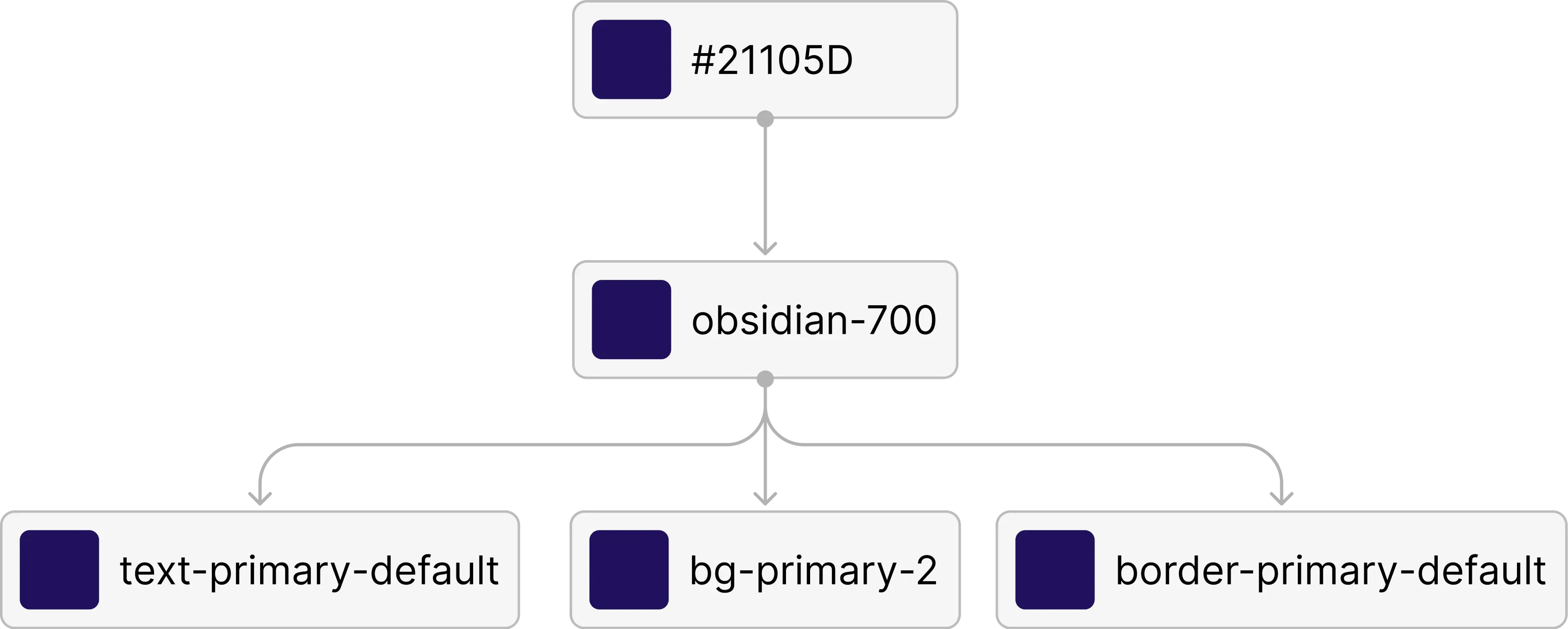
Buttons relying on our color system
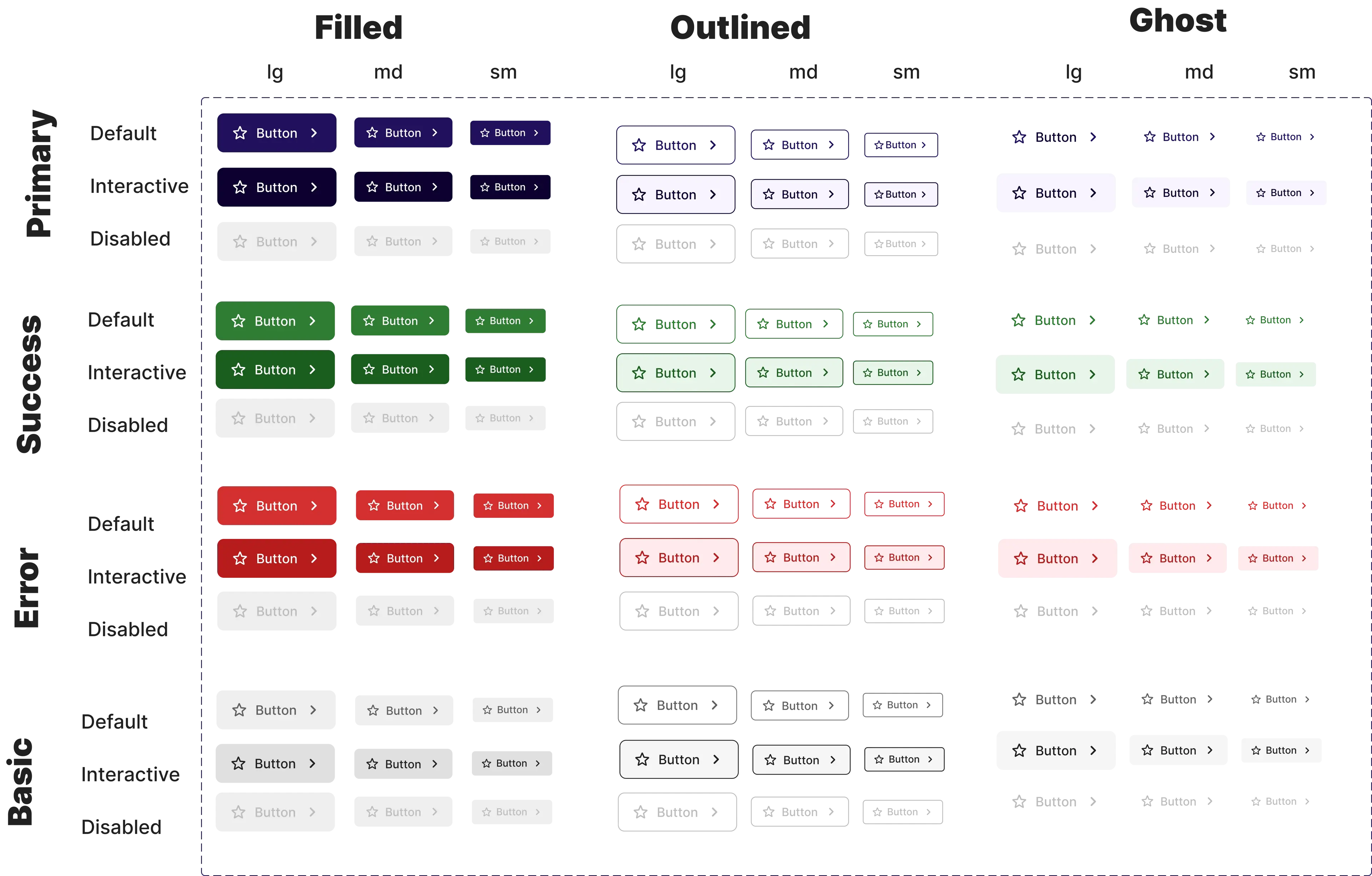
Note: After some deliberation, I decided NOT to create component level color variables, because it would overcomplicated our system in which it is not yet needed
UI Engineering
To get the design system started on the engineering side too, I made the initial code for it.
One challenge I met was that the frameworks and languages used on the engineering side for the main product were not component based.
1. Color variables (SCSS)
$colorPeach100: #ffefe1;
$colorPeach200: #ffdbc4;
$colorPeach300: #ffc3a6;
/* ... */
$colorBgPrimaryExtralight: $colorObsidian50;
$colorTextDefault: $colorGray900;
$colorTextHint: $colorGray700;
$colorTextContrast: $colorGray0;
/* etc. */
2. Font variables (SCSS)
.lead1Default {
	font-weight: 400;
	font-size: 1.125em;
	line-height: 27px;
	letter-spacing: 0;
	text-indent: 0;
}

.body1Default {
	font-weight: 400;
	font-size: 1em;
	line-height: 24px;
	letter-spacing: 0;
	text-indent: 0;
}

.body2Default {
	font-weight: 400;
	font-size: 0.875em;
	line-height: 21px;
	letter-spacing: 0;
	text-indent: 0;
}

.labelDefaultLarge {
	font-weight: 400;
	font-size: 1em;
	line-height: 24px;
	letter-spacing: 0;
	text-indent: 0;
}

/*etc..*/
3. No-component languages button styles (SCSS)
$button-sizes:
"large" 12px 24px 8px,
"medium" 8px 16px 6px,
"small" 6px 12px 4px;
.button {
display: flex;
flex-direction: row;
justify-content: center;
align-items: center;
border-radius: 8px;
cursor: pointer;
text-decoration: none;
transition: all .3s;
}
$variants:
'primary'
$colorTextPrimaryDefault
$colorTextContrast
$colorBgPrimaryDefault
$colorBorderPrimaryDefault
$colorTextPrimaryInteractive
$colorBgPrimaryInteractive
$colorBorderPrimaryInteractive
$colorBgPrimaryExtralight,
'error'
$colorTextErrorDefault
$colorTextContrast
/* etc... */
@each $name,
$textDefault,
$textDefaultOnSurface,
$bgDefault,
$borderDefault,
$textInteractive,
$bgInteractive,
$borderInteractive,
$bgLight in $variants {
.button-#{$name} {
&-filled {
@each $size,
$v-padding,
$h-padding,
$gap in $button-sizes {
&-#{$size} {
@extend .button;
background-color: $bgDefault;
color: $textDefaultOnSurface;
border: 1px solid $borderDefault;
&:hover,
&:active,
&:focus {
background-color: $bgInteractive;
color: $textDefaultOnSurface;
}
svg {
fill: $textDefaultOnSurface;
}
@if $size ==large {
@include orchLabelDefaultLarge;
}
@else if $size ==medium {
@include orchLabelDefaultMedium;
}
@else if $size ==small {
@include orchLabelDefaultSmall;
}
padding: $v-padding $h-padding;
gap: $gap;
}
}
}
&-outlined {
@each $size,
$v-padding,
/*etc...*/
}
}
}
}
.fill {
width: 100%;
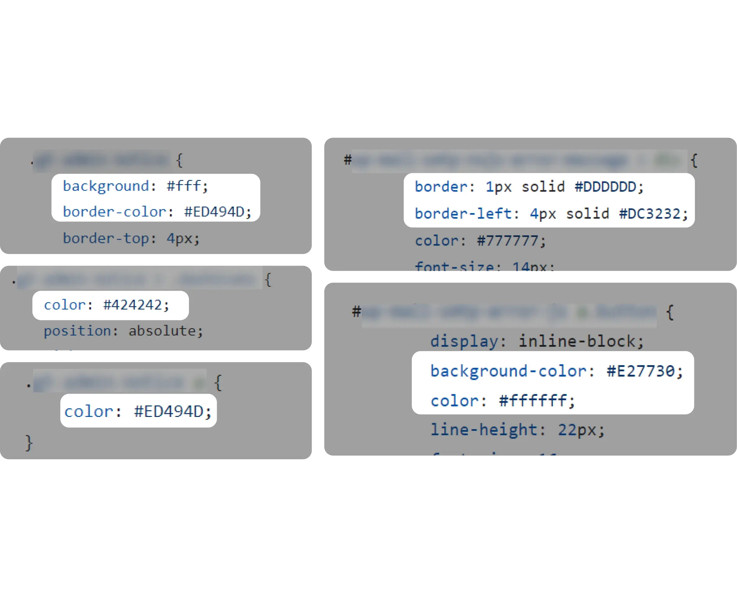
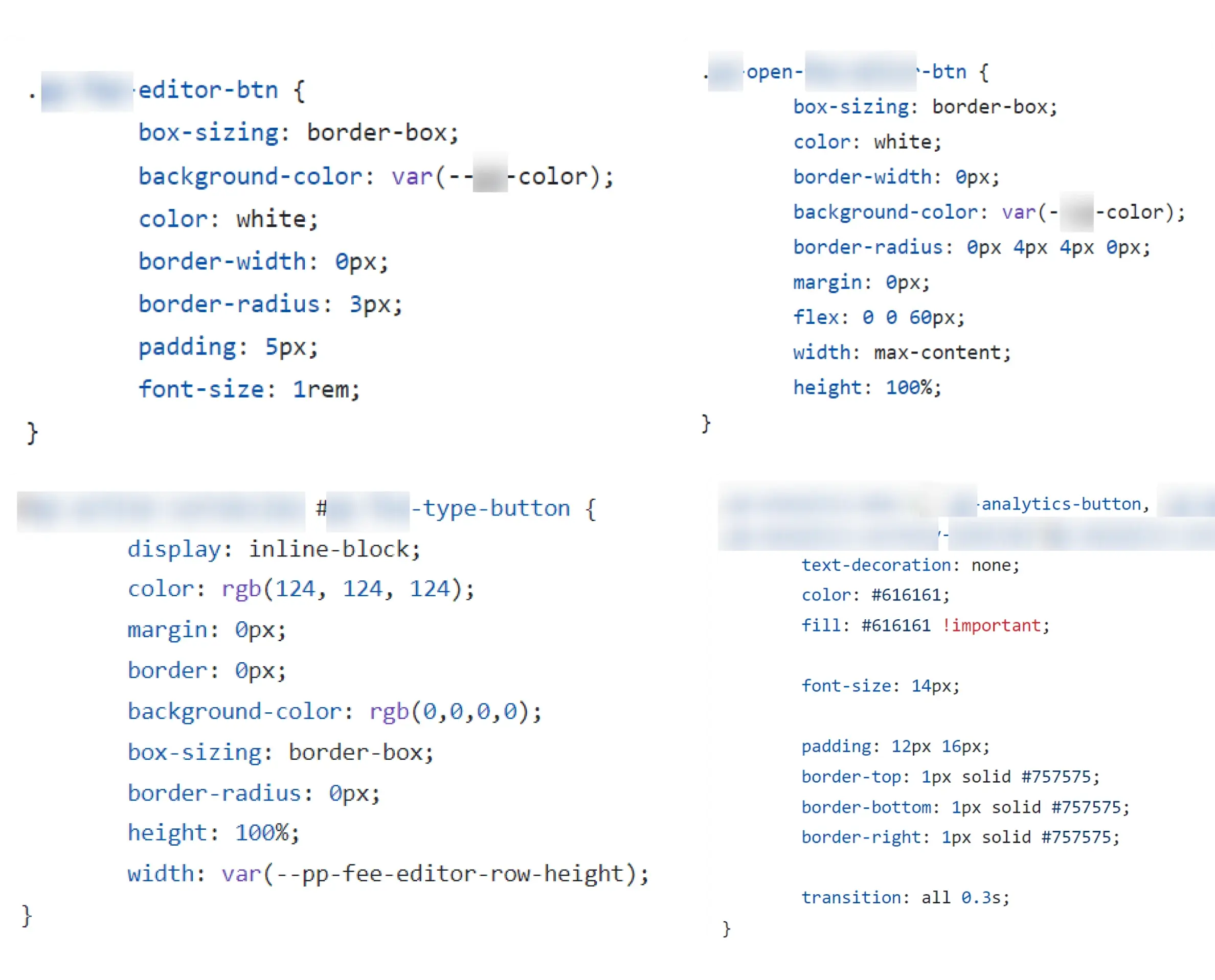
} UI Engineering
To get the design system started on the engineering side too, I made the initial code for it.
One challenge I met was that the frameworks and languages used on the engineering side for the main product were not component based.
1. Color variables (SCSS)
$colorPeach100: #ffefe1;
$colorPeach200: #ffdbc4;
$colorPeach300: #ffc3a6;
/* ... */
$colorBgPrimaryExtralight: $colorObsidian50;
$colorTextDefault: $colorGray900;
$colorTextHint: $colorGray700;
$colorTextContrast: $colorGray0;
/* etc. */
2. Font variables (SCSS)
.lead1Default {
	font-weight: 400;
	font-size: 1.125em;
	line-height: 27px;
	letter-spacing: 0;
	text-indent: 0;
}

.body1Default {
	font-weight: 400;
	font-size: 1em;
	line-height: 24px;
	letter-spacing: 0;
	text-indent: 0;
}

.body2Default {
	font-weight: 400;
	font-size: 0.875em;
	line-height: 21px;
	letter-spacing: 0;
	text-indent: 0;
}

.labelDefaultLarge {
	font-weight: 400;
	font-size: 1em;
	line-height: 24px;
	letter-spacing: 0;
	text-indent: 0;
}

/*etc..*/
3. No-component languages button styles (SCSS)
$button-sizes:
    "large" 12px 24px 8px,
    "medium" 8px 16px 6px,
    "small" 6px 12px 4px;

.button {
    display: flex;
    flex-direction: row;
    justify-content: center;
    align-items: center;
    border-radius: 8px;
    cursor: pointer;
    text-decoration: none;
	transition: all .3s;
}

$variants:
    'primary'
        $colorTextPrimaryDefault
        $colorTextContrast
        $colorBgPrimaryDefault
        $colorBorderPrimaryDefault
        $colorTextPrimaryInteractive
        $colorBgPrimaryInteractive
        $colorBorderPrimaryInteractive
        $colorBgPrimaryExtralight,
    'error'
        $colorTextErrorDefault
        $colorTextContrast
        /* etc... */

@each $name,
$textDefault,
$textDefaultOnSurface,
$bgDefault,
$borderDefault,
$textInteractive,
$bgInteractive,
$borderInteractive,
$bgLight in $variants {
    .button-#{$name} {
        &-filled {
            @each $size,
            $v-padding,
            $h-padding,
            $gap in $button-sizes {
                &-#{$size} {
                    @extend .button;
                    background-color: $bgDefault;
                    color: $textDefaultOnSurface;
                    border: 1px solid $borderDefault;

                    &:hover,
                    &:active,
                    &:focus {
                        background-color: $bgInteractive;
                        color: $textDefaultOnSurface;
                    }

                    svg {
                        fill: $textDefaultOnSurface;
                    }

                    @if $size ==large {
                        @include orchLabelDefaultLarge;
                    }

                    @else if $size ==medium {
                        @include orchLabelDefaultMedium;
                    }

                    @else if $size ==small {
                        @include orchLabelDefaultSmall;
                    }

                    padding: $v-padding $h-padding;
                    gap: $gap;
                }
            }
        }

        &-outlined {

            @each $size,
            $v-padding,
            /*etc...*/
            }
        }
    }
}

.fill {
    width: 100%;
}
Getting it to the developers
To encourage developers integrate the new system into the code, I did presentations, documentations,and code reviews.
One challenge I met was that the frameworks and languages used on the engineering side for the main product were no component based.
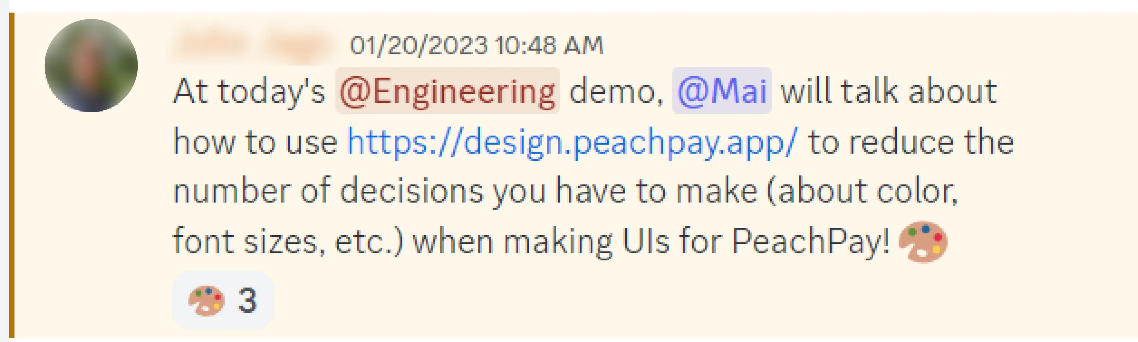
Gave a presentation to engineers as an introduction
Social mobile app helping people discover nearby places and connect with others
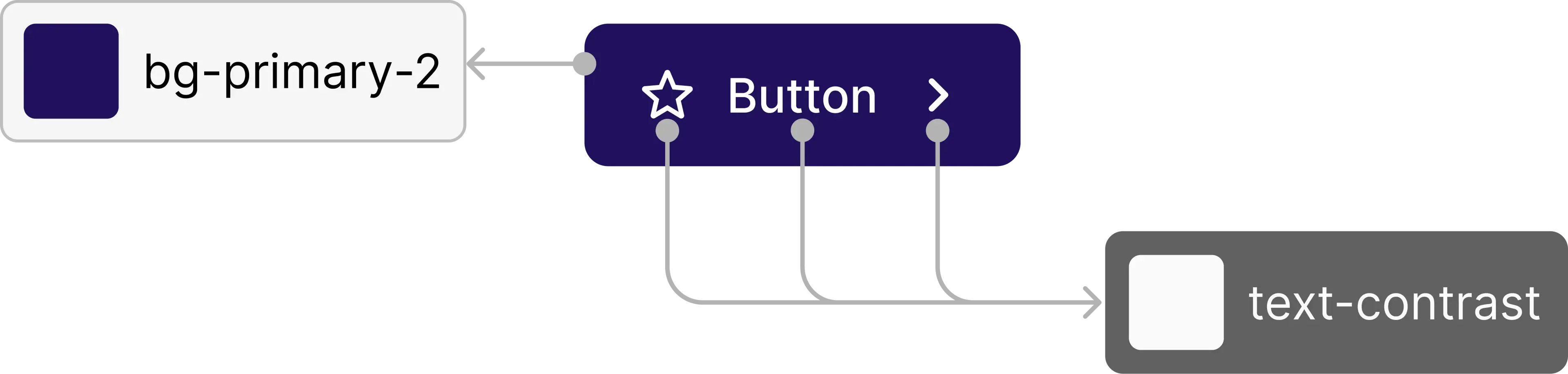
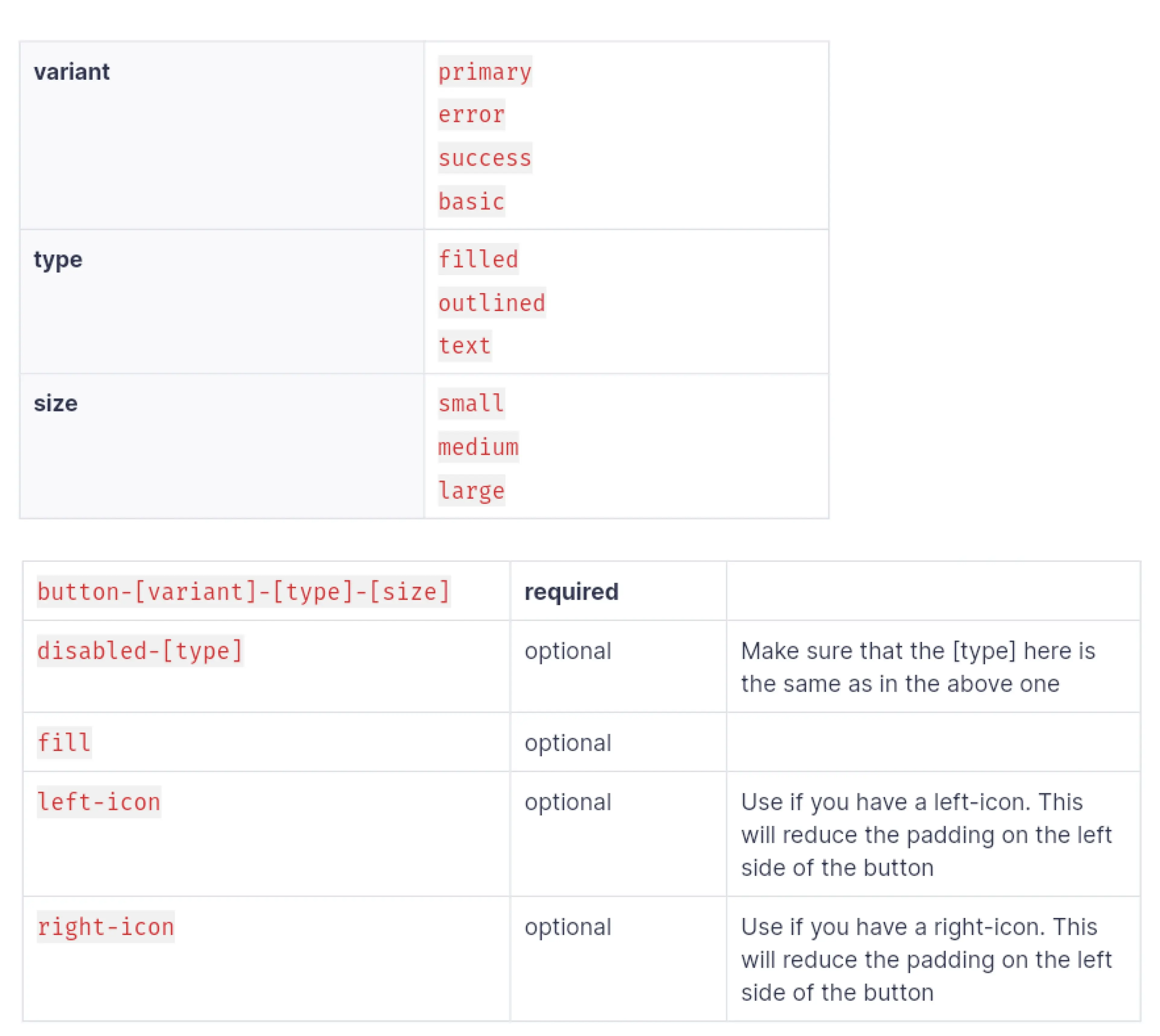
Button API
Social mobile app helping people discover nearby places and connect with others
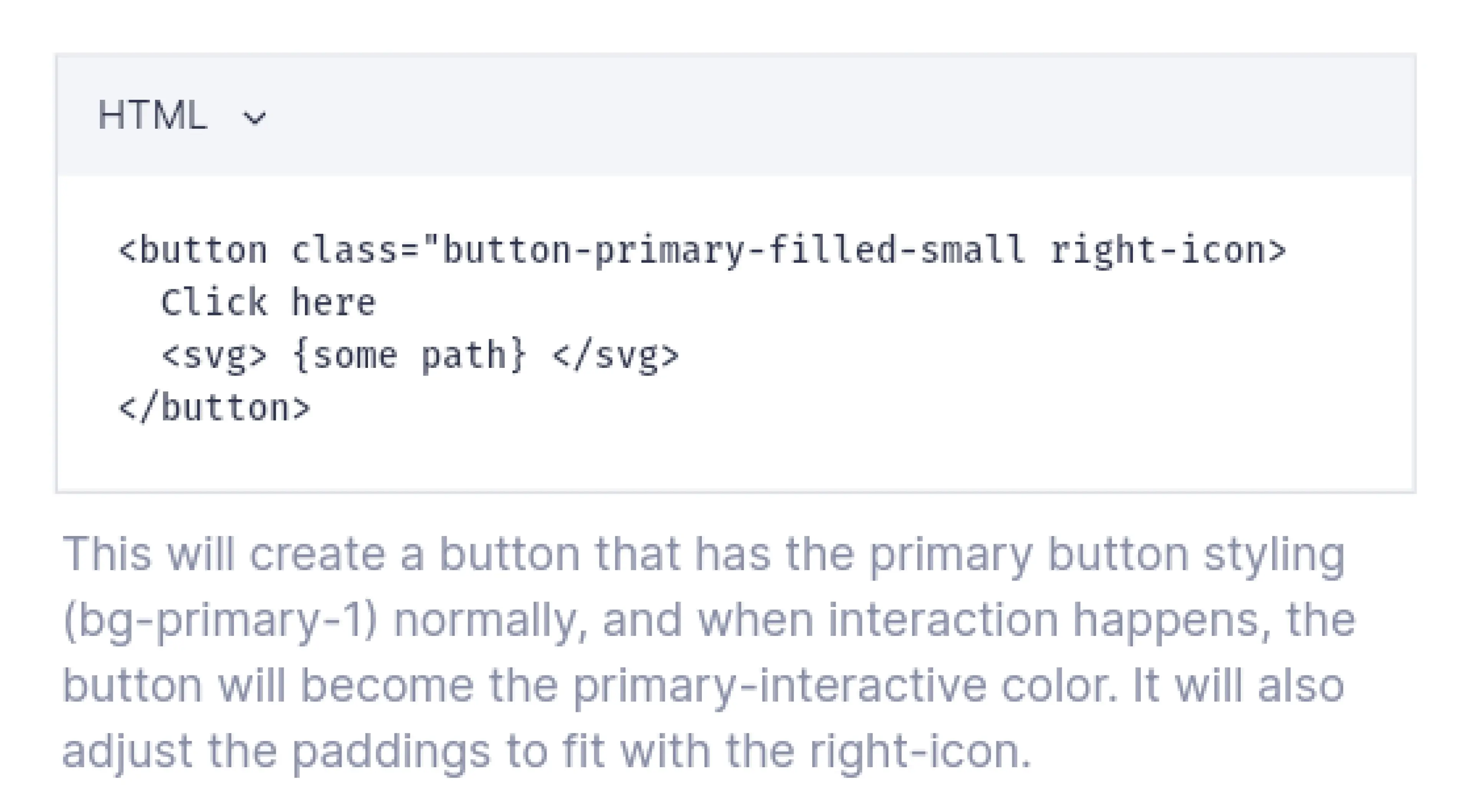
Code example
Social mobile app helping people discover nearby places and connect with others
Guidelines
Social mobile app helping people discover nearby places and connect with others
Getting it to the developers
To encourage developers integrate the new system into the code, I did presentations, documentations,and code reviews.
One challenge I met was that the frameworks and languages used on the engineering side for the main product were no component based.
Gave a presentation to engineers as an introduction
Social mobile app helping people discover nearby places and connect with others
Button API
Social mobile app helping people discover nearby places and connect with others
Code example
Social mobile app helping people discover nearby places and connect with others
Guidelines
Social mobile app helping people discover nearby places and connect with others
Impact
Reduced prototyping and development time by 30%
Defining our most used elements, colors and buttons, have improved production time drastically. Later in the year, we also ended up changing our colors around, and updating that was really easy, both on the design and development sides.
Improved consistency even if developers needed a button without design
Scalable & flexible as later on we found it easy to change primary colors
Reduced time for both frontend development and prototyping by 30%
Easy to adapt as the first push of the design system was kept small to help adjusting to it
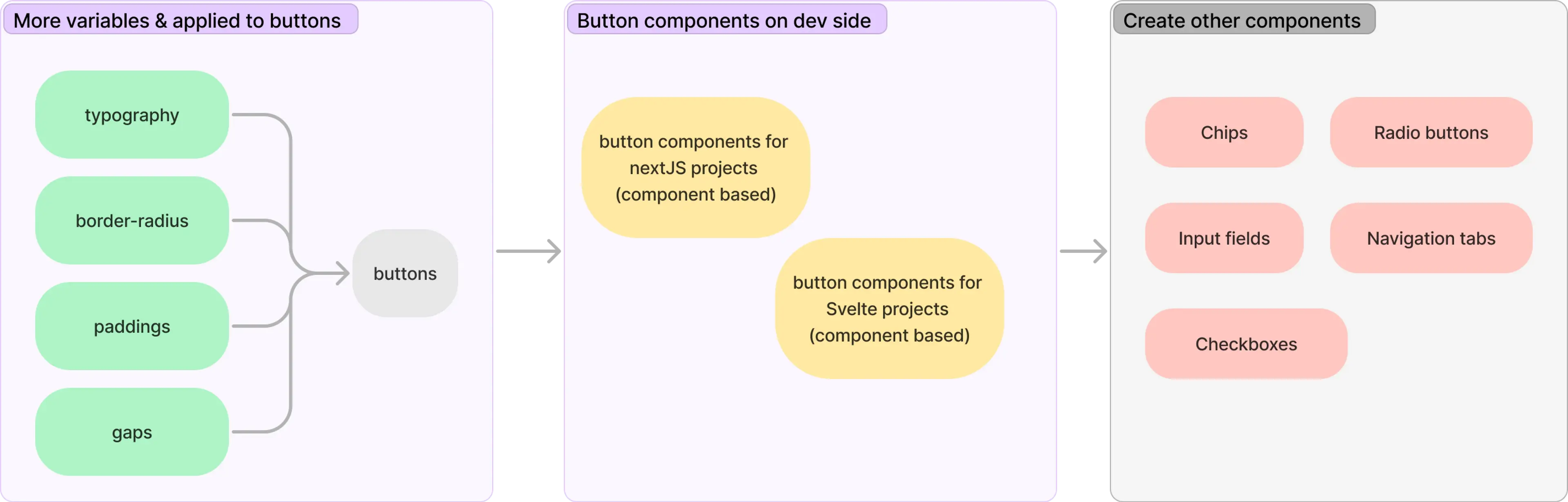
Next steps
Defining more variables, applying them to the button component, and slowly expanding the system more